
App Store vs Google Play Screenshots: Design Differences That Improve Installs
How screenshot strategy should change between App Store and Google Play, including layout, caption style, and sequencing decisions.
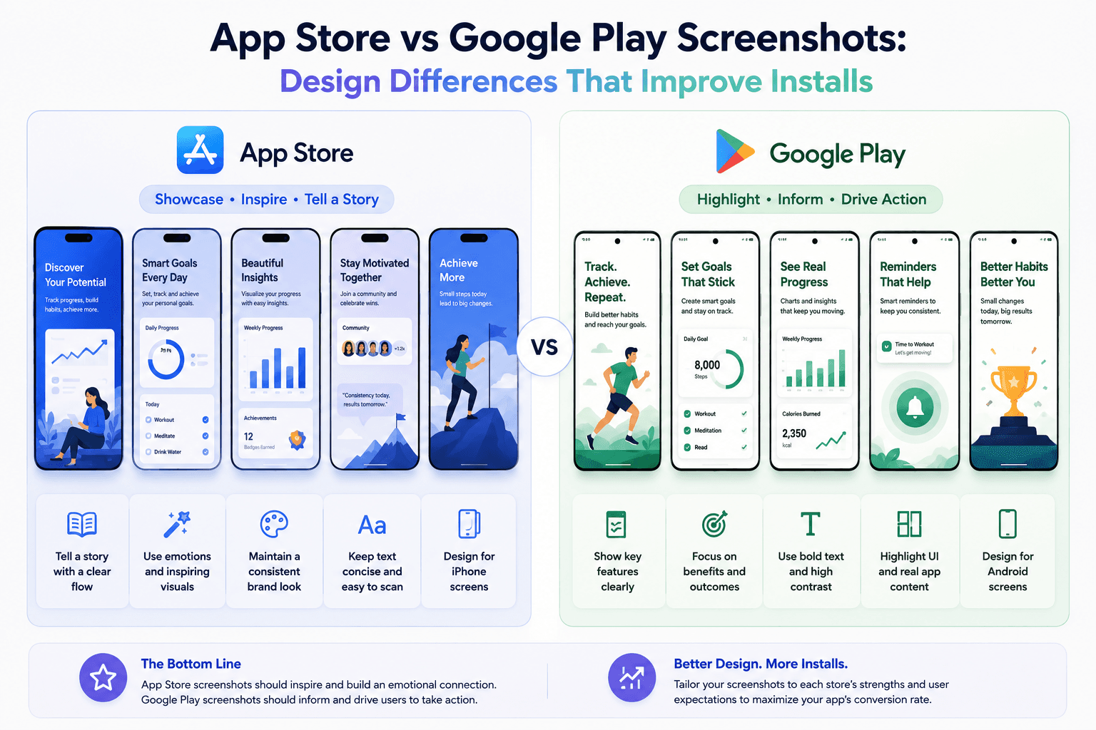
The same screenshot set rarely performs equally well on both stores. Platform context, layout expectations, and browsing behavior differ enough to justify tailored versions.
Why one universal set underperforms
Store context influences how users scan visuals. Reusing one exact set can hide product value on one platform.
Minor adjustments in framing, text density, and message order can produce better results.
How to adapt without doubling workload
Keep a shared base system (colors, typography, frame style) and branch per platform for copy and sizing.
Use templates so you can swap dimensions and captions without rebuilding all assets.
Where teams usually miss performance gains
Most teams optimize for visual polish only. Conversion gains often come from message clarity and sequence tuning.
Platform-specific first screenshots are usually the highest-leverage change.
Operationalize platform-specific variants
Keep two branches of the same visual set: one tuned for App Store ordering and one tuned for Google Play browsing behavior.
Screenza templates make this practical by letting you maintain consistent style while swapping copy, ordering, and dimensions per platform.
Key takeaways
- Avoid exact one-set-fits-all strategy.
- Adapt copy, ordering, and sizing per store.
- Reuse a shared visual base for efficiency.
- Prioritize platform-specific first screenshots.
Build faster
Create your next screenshot set in Screenza.
Use a template, replace the screens, edit the copy, and export polished App Store or Google Play screenshots without a design file.